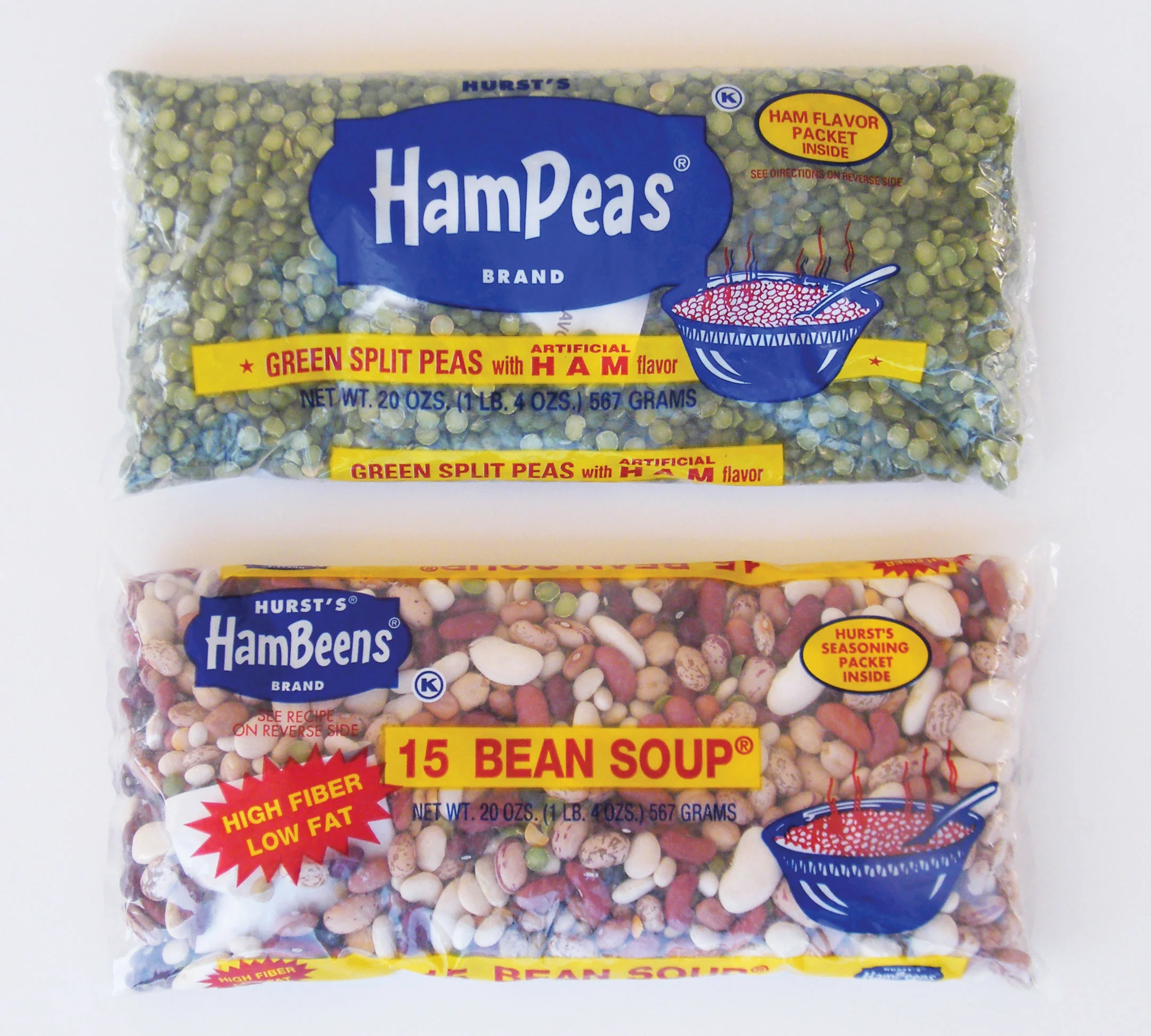
Hurst's Beans Re-Branding / Package Design
Project: Personal design project meant to help modernize the Hurst Brand in a playful, more meaningful way.
Process: The original package design, while familiar and in use for decades prior, felt very uninspired and in need of a change that would help it stand out more upon the typical supermarket shelf. By incorporating the original brand colors & copy, the packaging was allowed to take a practical turn to allow for a clip-out recipe option as well. The project went on to compete at the American Ad Federation's Addy Awards and was a winner of a Gold Student ADDY award at both the local and regional levels.
Role: Art Direction, Package Design.
Double Luck Re-Branding / Package Design
Project: After spotting a random can of green beans on a store shelf, it became my own personal project to re-design an existing label for Double Luck Green Beans.
Process: The original packaging felt very dated and definitely not like anything I would typically purchase myself, regardless of the price point. Instead, I opted for a more exciting look that would not only bring the can to the present-day, but help it feel right at home on a shelf at Target or Trader Joe's. Still sticking to its original "lucky" roots, I abandoned the four-leaf clover in favor of a couple of horseshoes instead. I also chose to go the illustrative route for the green beans, because no matter how you photograph it, they'll always be green beans.
Role: Art Direction, Package Design.


